


Two Tides Brewing Company
Two Tides Brewing Company is a small business located in Savannah, Georgia. For our project we were in teams (Matthew Finch and Eleanor McCune were my teammates) and we were to research this client and find a larger building / space in Savannah, Georgia for the owners to expand their growing business. Along with finding and designing a new space we also did the branding for the client.

Two Tides is a fun, quirky brewery. Two Tides is obviously well known for their different beers and sours but they are also known for their collaboration with local artists and other small businesses, community engagement, on site production, sustainable sources, social media presence, and their grab and go options.
Two Tides Brewing Company is currently located at 12 W. 41st in the Starland District of Savannah, Georgia.
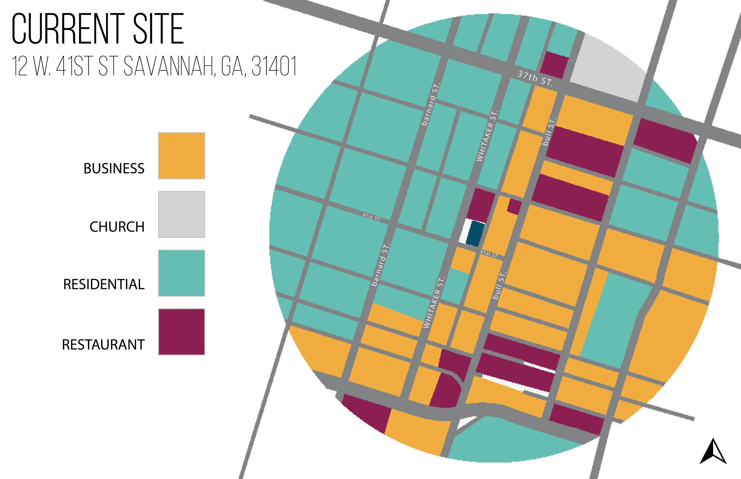
Current Location

New Location

Locations in relation to each other
Moving into branding the new space we wanted it to relate back to the original brand, Two Tides, because it is an extension of it. The name Two Tides came from the owner’s love of the sea and growing up on the islands near Savannah. Thinking of a new name we didn’t want it to be too nautical and came across the term Dogwatch.
DOGWATCH describes the task of surveillance on a ship deck. These periods are divided up into increments of usually two hours in a four hour period. It derives from the expression “dogged” the watch where mariners were allowed to break from their task. Inspired by this process, we wanted to implement this concept within our design and branding.
After finding the name and creating our two logos we started creating our color palette that we would follow throughout the space. We then applied these colors to our logos and then onto our collateral.

Collateral

We moved into concept after, picking out our architect, what we are inspired by, our ethos, what we want our space to feel like, and our muse, who/what we want to take from.
Concept

Our architect for our concept is Ricardo Bofill. Ricardo Bofill is a Spanish architect. We were inspired by his use of color and form within all of his buildings. The way he has created a strong visual identity throughout all of his projects is something we wanted to pull from. No two works of his looks the same yet they all express the same language.
Our ethos is First Friday and we want Dogwatch to embody the feeling of a First Friday Artwalk in Savannah. Designing the taprooms to feel more like pop-up spaces instead of confined rooms channels the idea of someone walking through set-up tents. At each space there is something new to experience and new to taste. It is important the circulation throughout the space mimics the easy and intuitive flow of First Fridays. People come knowing they will experience something new and something they will enjoy.
Our muse is a desert highway. Driving along a winding road in the desert allows you to escape. Each decision you make leads you to the next adventure. It is the quintessential aesthetic of the “Americana” road with the juxtaposition of blazing neon lights and the resilient terrain. It’s a dream for a nomadic lifestyle with its freedom and pleasure, something we wanted to embody in Dogwatch.
Furniture Plan

Continuing with this idea, inside of Dogwatch one will find smaller taprooms broken off from the main production. The beers poured in each room will vary along with the taproom itself. Following a monochromatic style, each room is an entirely new environment. We wanted the taprooms to feel less like rooms and more like partitioned spaces, like you would experience on a First Friday art march.
The final floor plan of Dogwatch displays the curved nature of the walls, inspired by Ricardo Bofill with half circle extensions of the north and east sides of the building. To create a strong, cohesive vocabulary, we extended this curvature into the walls of the smaller taprooms and the bar design throughout.
The smaller taprooms reflect our Ethos and Naming as they are divided into different ‘watches’ throughout. The production area, kitchen and employee space are all grouped together for efficiency and ease of access. We worked with the large square footage to create more intimate moments in the taprooms but wanted to create a very intimate unique space with the inclusion of our secret speakeasy room on the south of the building.

Front Façade
This is the front entrance and the North facade. There are three entry points. One on the right seen on the elevation brings you into the small taproom area. The entry under the main sign brings you into the hallway and then the To Go / Retail entry is on the left as well as on Price Street as you can see from the perspective. For the outside we wanted to bring the neon signs to include our branding and wayfinding. We decided to white wash the exterior brick as a way to create a neutral palette for the customer coming in because of our strong use of color for the interior. The round bump outs are inspired by our architect, Ricardo Bofill.

Liberty Street Elevation

Front Exterior Perspective

East & South Facades
The East and South Facades show the Price Street Entrance into the To Go / Retail area as well as the large windows that show into the main bar. These windows allow for passersby to look in. The East Liberty Lane shows the entrance for the employees in the South Façade as well as showing the entrance to the Speakeasy and into the outdoor bar area. Both facades show the whitewashed brick that we decided to use as a way to keep it neutral on the outside before you enter into a world of color.

Price Street East Façade Elevation

East Liberty Lane South Façade Elevation
To Go / Retail

To Go / Retail
The To-go / Retail area is of the utmost importance especially in these times. We are having to rethink ideas of how to make purchasing and receiving easy for the consumers. Being able to walk through easily with ample amounts of space allows the consumer to quickly grab what they need and go. This space utilizes a calmer color palette with the light grey concrete extending over white subway tiles to create a rounded counter for ease of access from all angles of the to go room. Neon signs adorn the walls over the beer coolers and merch displaying our range of branded colored logos on cans, growlers, totes bags, t shirts and glassware. We wanted to embody a roadside stop going along with our desert highway muse. The large garage door openings allow for the corner of Price Street and Liberty Street to become engaging and adds ease of access for guests to pick up beer to go quickly or to take some home after a day enjoying Dogwatch.

To-Go / Retail Elevation

To-Go / Retail Perspective

Golden Foam Taproom
The Golden Foam Taproom is the first taproom you see when entering the side entrance. We pulled from our golden foam color to create this monochrome look. We also reflected the rectangular shapes that Bofill uses. This room is backed up to production so the cutouts allow consumers to see behind the bar into where their drinks are coming from. The idea of connection process to fulfillment, all the way from the barrels to the customers is a key component in the Dogwatch brand.

Golden Foam Taproom Elevation

Golden Foam Taproom Perspective

Hazy Navy Taproom
The Hazy Navy Taproom takes inspiration from our architect, Ricardo Bofill and uses step-like cutouts which allows a unique way for customers to look into production. The largest of the smaller taprooms includes bar seating and also backs up to production. The neon signs allow for wayfinding and the lighting on the walls allows for the ‘first friday’ feeling and further wayfinding. The lighting is incorporated in the walls as it mimics the shapes of the transparent cut outs.

Hazy Navy Taproom Elevation

Teal Tides Taproom
The Teal Tides Taproom is located at the front by the street so it allows the customers to look out into Savannah as well as passerbys to look in. It is the only taproom not backed up to production but does allow for that street view. This taproom has the Teal Tides monochrome look along with circle cutouts. There is also wayfinding lighting on the wall.

Teal Tides Taproom Elevation

Teal Tides Taproom Perpective
Main Entrance
For the main entry we wanted to include the desert highway feel by using neon signs as wayfinding as you enter the brewery. We used the same hardwood throughout the entire space which gives it a residential feel.

Main Entrance Perspective

Main Bar
The Main Bar continues the monochrome look using the Second Story color. We wanted the main bar to remain fairly neutral as the other spaces are overloaded with color. Bringing in the hints of teal helped bring in the aspect of our color palette without it being too much. The main bar embodies the feeling of a greenhouse without actually being a functioning one. Adding in a skylight created extra sunlight that helped make you feel as though you were inside a greenhouse. For the base of the bar we wanted to include the curves like the bump outs we did for the exterior of the building inspired by our architect.

Main Bar Elevation

Main Bar Perspective

Chroma Coast Taproom & Food Ordering
The Chroma-Coast taproom is the last one of the four and uses our magenta color for the monochrome look. It’s a walkup bar and is backed up to production. And then to the left of that is our food ordering area. We wanted to include a food service in Dogwatch, but more so in a way like elevated finger food.

Chroma Coast Taproom and Food Ordering Area

Chroma Coast Taproom Elevation

Food Ordering Elevation

Production
The Production area is efficient with tanks lined against the wall with an elevated walk way for ease of access. Our Dogwatch colors are incorporated in the walkway and stairs as a way to further the brand. The canning station is in the center and the tanks are backed up near the wall for direct lines feeding into the smaller taprooms situated on the walls.

Production Elevation

Production Perspective

Outside Bar
Since Savannah is so warm most of the time, what better way to drink your beer than outside. The patio is designed with a greenhouse in mind and features a large custom colored concrete bar. The bar extends from the food counter inside. The trellis system allows for hanging plants and greenery to create that greenhouse vibe. The area is large and allows for block parties and food truck access from the alley.

Outside Bar Elevation

Speakeasy Taproom
The speakeasy is a fun way of bringing in a different crowd. With a deep purple monochrome look it allows for more of a subdued, intimate experience. It can be accessed from the back alley or from the secret door in the outdoor bar.

Speakeasy Elevation

Speakeasy Perspective

Building Sections
The building sections show our overall space. The longitudinal section shows our smaller taprooms and main bar.
The transverse section shows the outside bar, main bar, and to-go area in relation to each other.

Longitudinal Section

Transverse Section